Pool Tile Design Ideas for Orlando Area Renovations: A Guide to Waterline Bands and Visual Contrast
A lot of pool renovations start with a surface problem and end with a design decision. The finish is worn, the waterline tile is dated, maybe the color palette still screams 1998, and once the conversation starts, homeowners realize they have a chance to change the entire look of the pool without changing the shell itself.
That is where tile does a surprising amount of heavy lifting.
In the Orlando area, I have seen otherwise simple pools take on a cleaner, richer, more custom feel just by getting the waterline band right. The reverse is true too. A finish can be beautiful on paper, but if the tile fights the water color, the coping, or the house, the whole project feels slightly off. Not wrong enough to fail, but not right enough to love.
For homeowners planning an Orlando area pool renovation, tile selection is one of the few choices that affects the pool when it is full, when it is empty, in bright sun, under cloud cover, and at night with the lights on. It also sits at the eye line. People notice it immediately, even if they cannot explain why.
Why the waterline band matters more than most people expect
The waterline band is not just a strip of material that catches splash and sunscreen residue. Visually, it is the trim piece for the whole vessel. It frames the water, sets the transition between deck and interior, and can either soften or sharpen the pool’s outline.
When someone says they want the pool to look brighter, deeper, calmer, more modern, or more upscale, the waterline tile often plays a bigger role than the words “resurfacing” or “new finish” suggest. The plaster or aggregate finish creates the body color of the water, but the tile controls the edge definition. That edge definition is what gives a pool its visual crispness.
In a lot of Central Florida backyards, that matters because the pool is competing with strong sunlight, screen enclosures, pavers, stucco, landscaping, and in many cases a lot of reflected green from nearby trees. Tile can bring order to all of that. A muddy or overly busy band can make the waterline look restless. A well-chosen band can calm the whole scene down.
This is especially true if you are planning pool resurfacing Windermere FL, pool remodeling Dr. Phillips, or a pool renovation Lake Nona project where the house already has a strong architectural style. The pool should look like it belongs there, not like it was decorated from a different property.
Start with the water color you want, not the tile sample you happen to like
One of the easiest mistakes in tile selection is falling in love with a sample board before deciding what the finished pool should feel like. A two-inch tile sample in your hand does not show you the pool. It shows you a fragment.
The better starting point is the water itself.
Do you want the water to read light blue and airy, medium blue and classic, or slightly deeper and more reflective? Once that direction is set, tile becomes much easier to choose because you are no longer shopping for an object. You are building an effect.
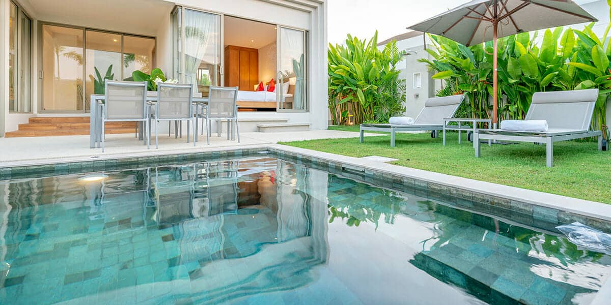
A lighter interior finish paired with a dark waterline band can create a strong outline, which some homeowners love because it makes the shape look tailored. That same contrast can feel a little severe on a softer freeform pool. On the other hand, a tile that sits close in tone to the interior finish can create a smooth, low-contrast look that feels relaxed, though sometimes it lacks definition from across the yard.
There is no universal best answer. It depends on the shape of the pool, the color of the deck, and how much visual energy the backyard already has.
If you are comparing pool finishes Oviedo homeowners often gravitate toward with tile options that feel contemporary, this is where the conversation usually gets more precise. The tile should not just be “pretty.” It should either create contrast on purpose or blend on purpose. The accidental middle ground is where many renovations lose their punch.
Understanding visual contrast without overdoing it
Visual contrast sounds technical, but the principle is simple. You are deciding how much separation you want between the waterline, the interior, and the surrounding deck.
High contrast makes lines more noticeable. Low contrast makes surfaces feel more continuous.
A dark blue, charcoal, or deep mixed-glass band against a light interior finish creates a clear perimeter. It can sharpen a geometric pool beautifully. It also tends to stand out when the pool is empty, which matters during construction and whenever water levels drop. Some homeowners love that finished, architectural look. Others find it too hard-edged for a backyard meant to feel easy and informal.
A softer blue or muted blend that stays close to the water color can make the tile disappear a bit once the pool is full. That can be elegant. It can also make the pool feel larger because the eye is not stopping at a dark border. On a compact pool, that visual trick is useful.
Contrast is not only about color. It is also about pattern and reflectivity. A highly reflective tile catches sun and pool light differently throughout the day. That shimmer can be beautiful, but it also introduces more movement at the edge. A matte or lower-sheen look feels steadier and quieter.
I usually tell homeowners to think about the tile as a sentence ending. Do you want a period or an exclamation point? Both can work. Most disappointments happen when the pool needed one and got the other.
Matching tile to pool shape and house style
Not every pool calls for the same tile language. A formal rectangular pool with straight lines can carry a crisp, narrow-module tile with stronger tonal variation. The geometry supports it. A lagoon-style or freeform pool usually looks better when the tile has a more fluid rhythm and less rigid visual repetition.
The house should get an equal vote. If the home exterior is quiet and neutral, the pool has room to be a little more expressive. If the home already has patterned pavers, bold trim, and a busy outdoor kitchen finish, the waterline tile often needs to simplify the picture rather than add another layer of activity.
This comes up often in Altamonte Springs pool remodeling discussions where the pool area has evolved over time. Maybe the deck was redone years ago, the patio furniture is newer, the enclosure framing is a certain color, and now the pool itself is the last old-looking element. In that scenario, the tile has to connect old and new. It is less about chasing a trend and more about editing the space so it reads as one project.
That same balancing act shows up in pool resurfacing Sanford FL jobs where the goal is not necessarily dramatic reinvention. Sometimes the smartest renovation is one that makes the pool feel cleaner, newer, and more intentional without making the backyard look renovated in pieces.
Waterline tile is small, but scale still matters
Tile pattern scale gets overlooked all the time. People focus on color and ignore how busy the tile will read across the full run of the pool.
A tiny mosaic with several shades can look elegant in a sample board but become visually noisy around a long perimeter. A simpler blend often has more staying power because your eye can read it from a distance. On the other hand, a tile that is too flat in tone can look lifeless once installed, especially if the surrounding materials are also muted.
This is where sample viewing matters. If possible, seeing several tiles side by side with the chosen interior finish is more useful than judging them individually. Some combinations that look underwhelming in the showroom come alive when paired. Others that seem dramatic alone cancel each other out once combined.
For an Orlando area pool renovation, sun exposure complicates this in a good way. Bright light tends to flatten some colors at midday and intensify reflections in the morning and late afternoon. If the pool is under a screen enclosure, the look may stay more controlled and less sparkly than it would in direct open sky. That is not better or worse, just different. The enclosure changes the way the tile presents itself.
When to use a bold waterline band
There are times when going bold makes perfect sense. If the pool shape is clean, the coping is simple, and the backyard needs a visual anchor, a stronger band can do that work.
A bold band also helps when the pool edge needs more definition relative to the deck. If the pavers and coping are light and close in tone to the water, the perimeter can wash out visually. A darker or more saturated tile restores the edge. This can be especially effective on raised bond beams or spa spillover areas where the tile is visible above the waterline as well.
The caution is proportion. If there are multiple tiled features, such as a spa face, raised wall, or accent steps, the bolder tile travels farther than people expect. What looked tasteful in a six-inch strip can become dominant when repeated vertically.
That is why restraint matters. A dramatic tile should usually be paired with calmer supporting materials. If everything around it is trying to get attention, the project loses hierarchy.
When subtle tile delivers the better result
Subtle tile is not the safe option by default. Often it is the more refined one.
If the goal is a pool that feels timeless, calm, and integrated with the yard, a low-contrast band can be exactly right. It lets the water be the star. It also tends to age gracefully because it is less tied to a strong moment in design taste.
This approach works particularly well when the renovation includes updated finish color and pool lighting upgrades. At night, underwater lighting can pull unexpected tones out of tile. A subtle band often responds more gently, which creates a smoother evening look. If the tile is very high contrast or strongly reflective, night lighting can make the waterline feel sharper than intended.
For homeowners who entertain often, that nighttime read matters. Most people choose tile in daylight and live with it after sunset.
The relationship between tile and resurfacing
Tile and interior finish should be chosen as a pair, not as separate line items. Technically, resurfacing and tile replacement are different parts of the renovation scope, but aesthetically they are inseparable.

Florida code material notes that resurfacing the pool interior to the original nontoxic, slip-resistant, smooth specifications, or equivalent, is not considered a modification in that code context. That matters from a technical standpoint, but from a design standpoint, even a straightforward resurfacing can completely change the look of the water once new tile is part of the package.
That is why homeowners doing pool resurfacing Windermere FL or pool resurfacing Sanford FL should not treat tile as an afterthought. The finish sets the water body color. The tile tells your eye where that body begins and ends. If those choices are made in different moods or on different timelines, the result can feel disconnected.
A cool-toned finish with a warm-toned tile blend is a common source of subtle disappointment. Neither material is wrong. They backyard pool refresh in Orlando just are not speaking the same language.
A few design checkpoints before you commit
The easiest way to avoid regret is to slow down before ordering material. Once tile is installed around an entire pool, small doubts get expensive.
- Look at the tile next to the intended interior finish, not by itself.
- Judge it in bright daylight if possible, because pool environments are unforgiving to color mistakes.
- Consider how much of the tile will be visible above water on spas, raised walls, or spillways.
- Think about night appearance if pool lighting upgrades are part of the renovation.
- Make sure the tile works with the deck, coping, and house exterior, not just the water.
Those five checks catch a lot of issues early.
Renovation planning in the Orlando area has practical constraints
Design is the fun part, but pool renovation work in the Orlando area also has real administrative and scheduling considerations. Local permit requirements can apply depending on the scope of work. The City of Orlando’s residential pool and spa guidance indicates that a typical residential pool or spa project may require building and electrical permits, and sometimes plumbing or gas permits. Separate permits may also be needed for items like screen enclosures, gas piping, solar, and fencing.
For homeowners, that matters because a renovation that begins as “just tile and finish” can expand. Add a heater, rework some lighting, touch the deck, modify a screen enclosure, or update a barrier component, and the paperwork picture may change. The city also notes that submittals should include a site plan or survey, and owner-builders may need an Owner/Builder Declaration and, in some cases, a recorded Notice of Commencement.
This is not design advice so much as practical timing advice. If your renovation includes cosmetic work plus functional upgrades, ask early what falls under the main permit and what may require separate permits. That is especially important when homeowners are trying to coordinate resurfacing with pool lighting upgrades or other site work.
Orlando’s checklist also points to erosion and sediment control, site drainage, existing conditions, easements, and distances to property lines and nearby improvements as part of planning considerations. Those items may feel far removed from tile selection, but they affect scheduling and scope. A beautiful tile choice does not help much if the project timeline slips because a related site issue was overlooked.
HOA communities add another layer
A lot of neighborhoods across the region have association review requirements. The City of Orlando specifically notes that HOA approval may matter in addition to city rules. Anyone planning HOA pool resurfacing should take that seriously early, not after materials are chosen and installation dates are penciled in.
This comes up often in communities where exterior color palettes are tightly managed or where visible changes from the rear elevation still require approval. Even if the waterline tile seems like a small detail, some associations care about any exterior alteration that changes appearance. If the pool includes a raised spa wall, decorative water feature, or visible beam tile, the change can be more noticeable from neighboring lots than the homeowner expects.
The practical move is simple. Confirm what the HOA wants to review before locking in materials. It saves time and keeps a straightforward renovation from becoming a stop-and-start process.
Weather affects renovation timing more than tile taste
Central Florida’s warm-month rainy season brings frequent showers, thunderstorms, humidity, and summer heat. Heat and humidity can also linger into early or mid-October, and tropical systems can influence that seasonal transition. Anyone scheduling an Orlando area pool renovation should build that reality into expectations.
This does not mean renovations cannot happen during those months. It means schedules should have breathing room. If a project includes draining the pool, surface prep, tile work, interior finish work, and startup, weather can interfere with pacing. Homeowners are usually happier when they approach the calendar realistically instead of expecting a weatherproof construction sequence in the middle of a storm-prone stretch.
From a design standpoint, this timing issue has one hidden benefit. A little patience on the front end often creates room for better material decisions. Rushed tile choices tend to happen when homeowners feel schedule pressure. Careful projects usually look more coherent in the end.
Safety and inspection items still matter during aesthetic upgrades
Even when the design focus is tile, color, and finish, pool work does not exist apart from safety requirements. Orlando’s residential pool checklist includes safety-barrier and gate requirements for typical residential pools, and final inspections are tied to items such as the pool deck, pump, and child barrier. Orange County guidance also references pool barrier affirmations and notes that some features may require separate permits rather than being folded into the pool permit.
The key point here is that visual upgrades often intersect with code-related components. If a renovation touches the deck, equipment, barriers, lighting, or accessory features, those parts of the job may carry inspection implications beyond the decorative scope. It is one more reason integrated planning beats piecemeal decision-making.
Design combinations that tend to age well
Homeowners often ask what tile style will still look good years from now. Nobody can promise timelessness, but some combinations usually wear better than others because they rely on balance rather than novelty.
- A medium-contrast blue blend with a finish that supports clear, classic water color
- A charcoal or deep blue band used on a crisp geometric pool with restrained surrounding materials
- A soft, low-contrast tile on a freeform pool where the goal is calm and continuity
- A tile chosen to coordinate with visible spa or raised wall surfaces, not just the waterline alone
- A finish and tile pairing that looks good in daylight and under pool lighting upgrades
What ages fastest is usually not a specific color. It is excess. Too much shimmer, too much contrast, too much pattern, too many unrelated materials in one backyard.
The best tile choice usually feels obvious after the hard thinking is done
The funny thing about good pool tile is that once it is installed, it often seems inevitable. It looks as if the pool was always supposed to have that band, that tone, that level of contrast. That sense of rightness is usually the result of careful decisions that happened before a single tile was set.
If you are planning pool remodeling Dr. Phillips, a pool renovation Lake Nona project, evaluating pool finishes Oviedo options, or sorting through Altamonte Springs pool remodeling ideas, focus less on what is fashionable in a sample rack and more on what your backyard needs visually. Decide whether the pool should read crisp or soft, dramatic or quiet, high-contrast or blended. Tie the waterline tile to the finish, the coping, the architecture, and the way the pool is used after dark.
That is how renovations stop looking like a bundle of upgrades and start feeling like a finished place.
And if the project also involves permits, HOA pool resurfacing review, lighting changes, or related site work, treat those as part of the same planning conversation. The tile may be decorative, but the process around it is not. When both sides are handled well, the final result feels easy, which is exactly what most people wanted from the pool in the first place.